Friday, May 21, 2010
Thursday, May 20, 2010
Tuesday, May 11, 2010
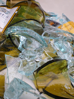
Yellow Tail.
 Here is my attractive photo. I wanted it to represent alcoholism by breaking wine bottles, and it turned out to be a beautiful picture. I love how the two different colors of class combind and compliment eachother and how the light reflects off some of the particles in the glass. No editing was done to enhance this photo - so I am extra happy about how good the color turned out.
Thursday, May 6, 2010
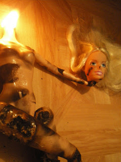
Malibu Barbie.

Okay, before anyone makes any assumptions - I'm not some crazy girl that decides to light her barbies on fire in her spare time. I chose this composition for my disturbing photo because I am terrified of dolls. I felt that a creepy photo of a doll would be the definition of "disturbing." I like the placement of the doll, and I find it very eerie that the doll has a smile on its face. I took this photo in candle light, and I thought that this lighting added to the photo by creating a mysterious feel.
Tuesday, May 4, 2010
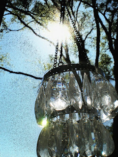
Reflection.
 For this photo, I took a small, candle-lit chandelier and held it up to the daylight to create two different light sources. I then faded away the background and added a spray stroke effect in photoshop. This is not one of my most favorite photo's, however I do like how it turned out. I love how you can see the light shining behind the tree branch and how it reflects off the chandelier.
Game Time.
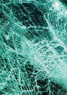
Shattered Windshield
 I created this photo by taking a picture of my shattered windshield on my car. I added the neon glow to this photo and I think it complimented my composition very well. I like how the details and cracks in the glass stand out and I think the neon glow added just the touch I needed. I
 love how the photo has a blue tint to it, almost making the glass look like water.
Rose.
Subscribe to:
Posts (Atom)


